SCH : PREQUEL GIULIO
-
SCH : PREQUEL GIULIO -
PROJECT : Prequel GiulioROLE : Logo DesignerYEAR : 2024CLIENT : SCHDesigned for Prequel, the prologue chapter of SCH's J”VLIVS” universe, this project began with the creation of a custom Italian-inspired letterform tied to the imagined birth of the character Julius, here introduced as Giulio.
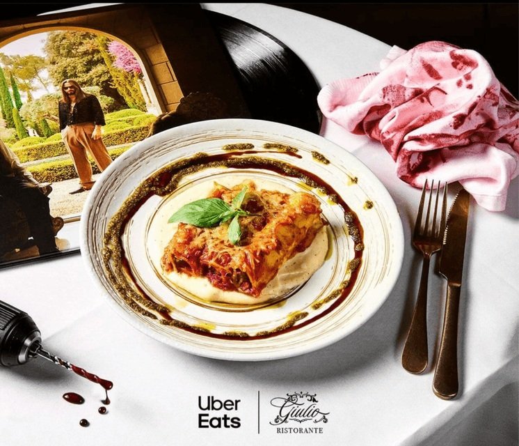
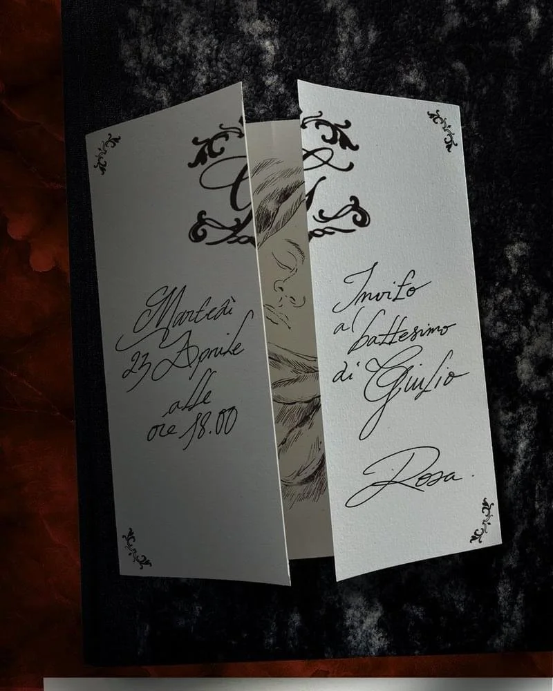
The mark was first created for a series of announcement cards and media invitations written in Italian, conceived as a fictional birth notice and narrative artifact within the album's storytelling. From there, the letterform expanded beyond its original function to become a central visual motif reused across the Giulio pop-up restaurant and a wider range of campaign assets linked to the release.
Its applications extended across signage, printed collateral, packaging, merchandise and branded collaborations, allowing a single typographic gesture to anchor an entire world of visual references around the project.
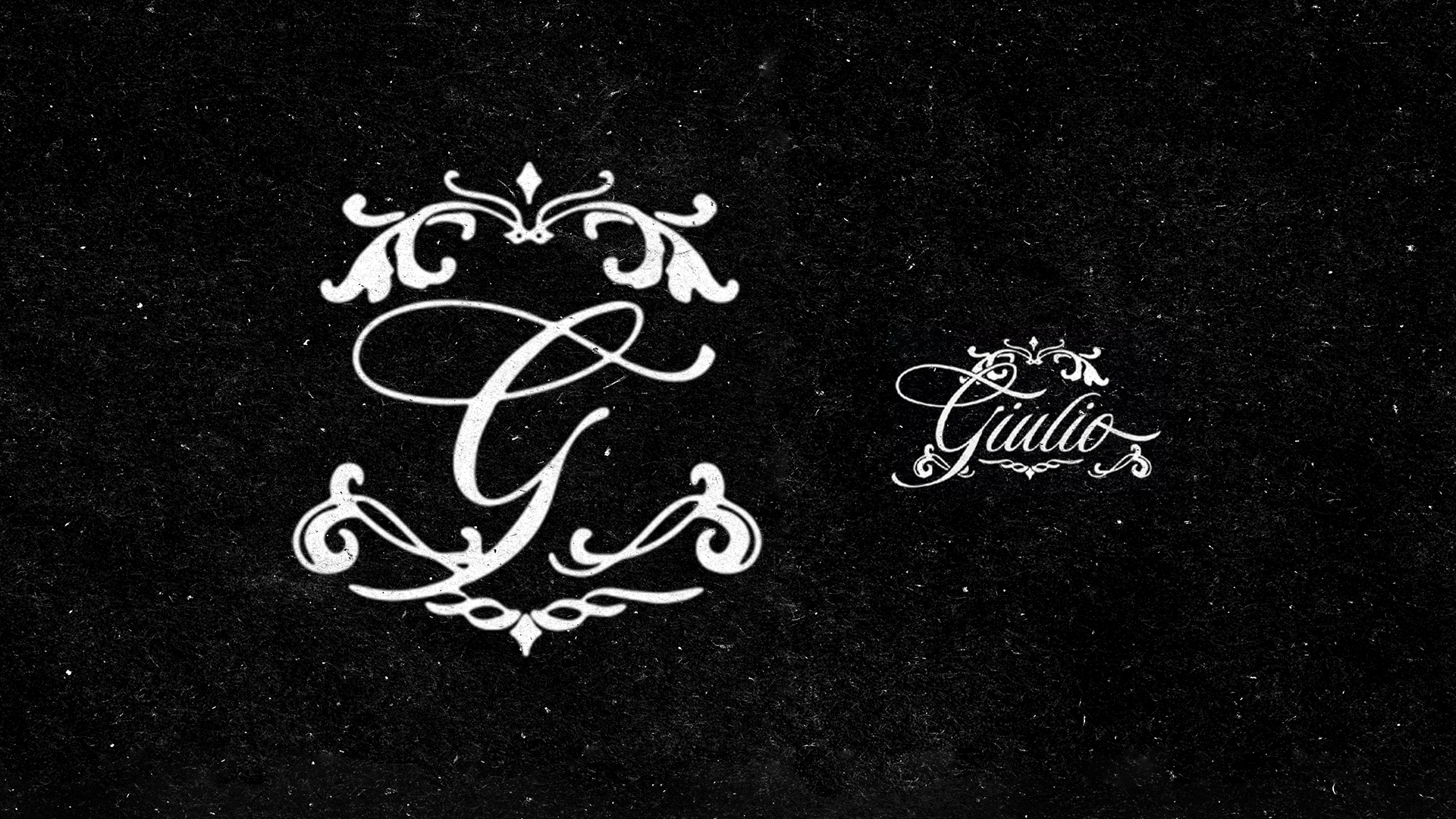
Custom Italian Letterform
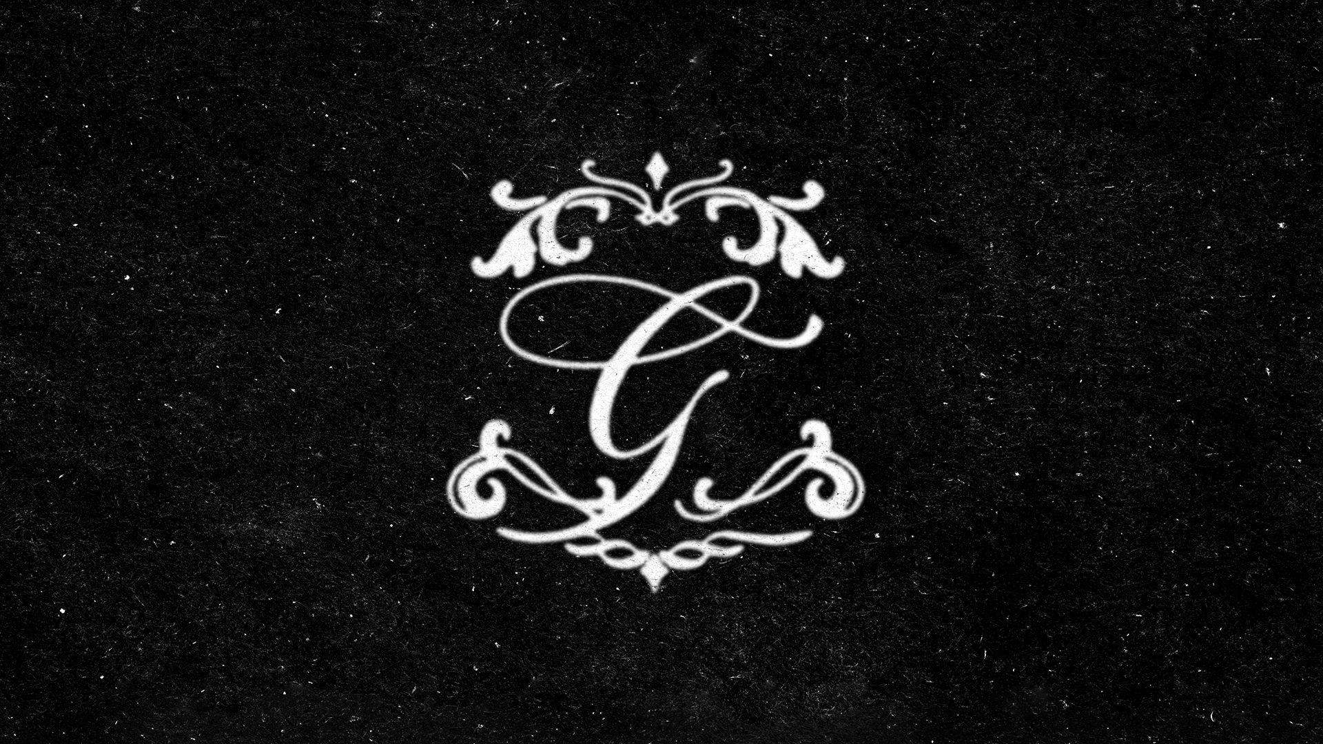
Designed in Illustrator, presentation made in PhotoshopThe project began with the creation of a custom “G” monogram inspired by Italian calligraphy, historical emblems and traditional ornamental lettering.
Particular attention was given to balance, rhythm and decorative details, allowing the symbol to feel both refined and theatrical. The surrounding flourishes were designed as an extension of the letter itself, creating a cohesive mark that could stand independently while remaining highly recognizable.
Rather than functioning as a simple logo, the letterform was conceived as a narrative object — a visual clue rooted in the fictional history of Giulio and the broader JVLIVS universe.

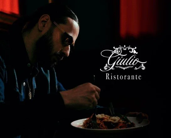
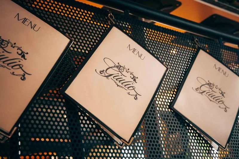
Designed in Illustrator, presentation made in PhotoshopAlongside the standalone monogram, a full “Giulio” wordmark was developed to extend the identity into a more expressive and readable signature.
While the “G” emblem acted as the central symbol of the project, the complete version introduced a stronger sense of character and storytelling. Its calligraphic structure echoed the visual language of Italian handwritten invitations, family emblems and traditional hospitality, reinforcing the fictional heritage surrounding the Giulio persona.
Designed to work across both intimate printed materials and larger brand applications, the wordmark helped bridge the gap between narrative artifact and fully recognizable visual identity.
From Narrative Object to Visual Identity
Initially created for announcement cards and media invitations, the monogram was designed to support the storytelling behind Prequel : a flashback into the birth of Julius, reimagined through the Italian identity of Giulio. As the campaign expanded, the letterform evolved beyond its original use and became a recurring visual signature across the project. Its ornate and timeless quality allowed it to move naturally from printed invitations to restaurant signage, packaging, menus and promotional materials. This transition from narrative artifact to full visual identity gave the mark a central role in connecting the fictional world of the album with its real-world activations.

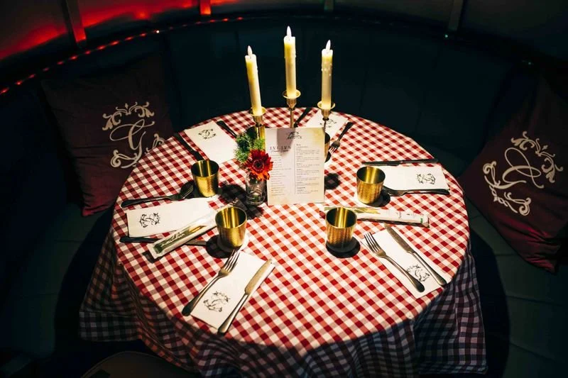
Brand Applications
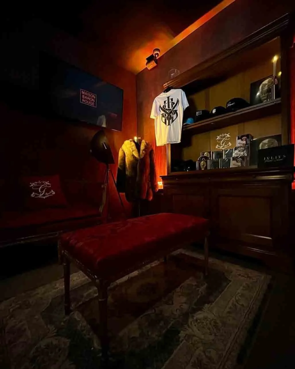
The Giulio monogram was later deployed across a wide range of physical and promotional touchpoints, giving the identity a tangible presence within the album campaign.
From the pop-up restaurant facade and interior details to menus, table settings, packaging, merchandise and branded collaborations, the mark became a unifying element throughout the experience. Its ability to adapt across scales — from small printed details to large environmental applications — helped reinforce the immersive nature of the project.
By appearing across both intimate objects and public-facing campaign assets, the letterform became more than a graphic element: it acted as a visual anchor for the Giulio universe.